I've noticed it in several places but these are the only ones I've grabbed a screenshot or made a note of:
"Confirm" on the password confirmation prompt:

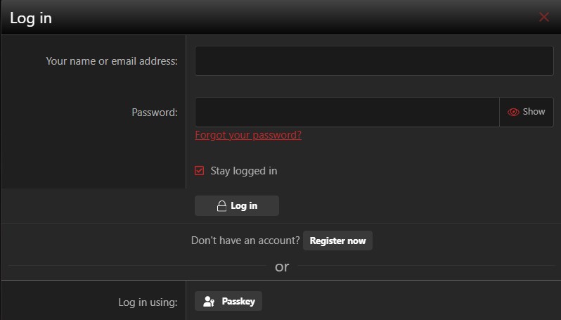
"Log in" on the log in screen:

Also "Register" on the initial registration box and "Send direct message" when sending a PM.
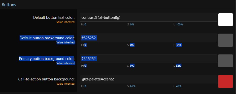
Is there a way to change these everywhere without also affecting them where they look correct (examples being the "Register Now" and "Passkey" buttons in the previous screenshot)? I'll start keeping track better when I notice them.
"Confirm" on the password confirmation prompt:
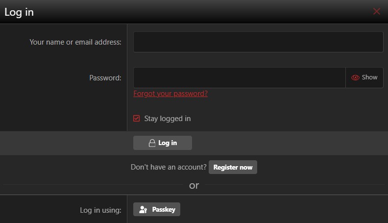
"Log in" on the log in screen:
Also "Register" on the initial registration box and "Send direct message" when sending a PM.
Is there a way to change these everywhere without also affecting them where they look correct (examples being the "Register Now" and "Passkey" buttons in the previous screenshot)? I'll start keeping track better when I notice them.